World Heritage Site
MALOTI-DRAKENSBERG PARK
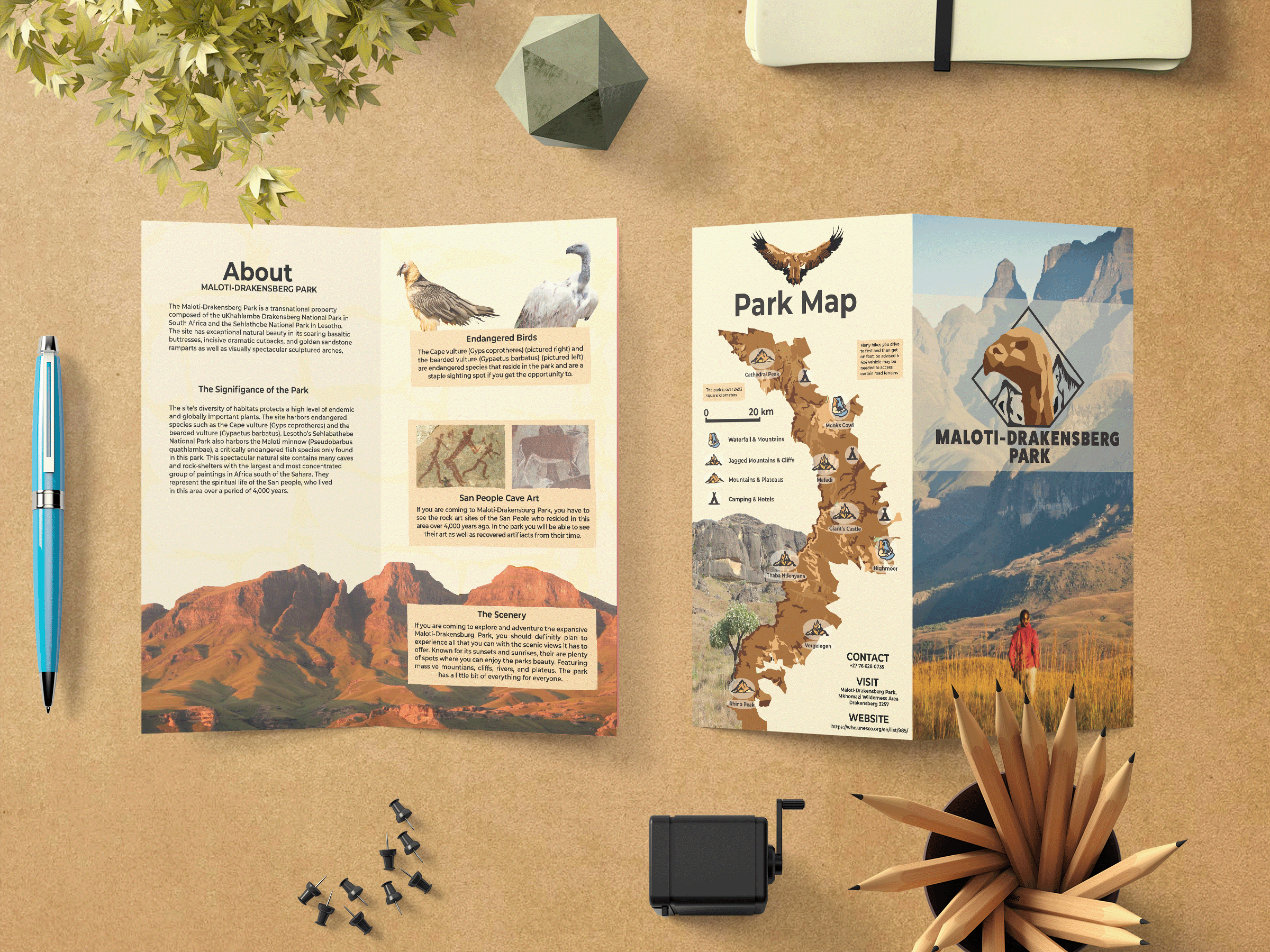
Drawing from Maloti-Drakensberg Parks endangered species, terrains, and cultural heritage led to creating a developed brand identity. Keeping a cohesive design through all elements, focusing on guiding principles such as layout, negative space, and color, a balanced brand identity is maintained. Consistent alignments and generous margins in typography and imagery ensure precise spacing. Creating a consistent system was important to keeping a clean aesthetic. The strategic use of negative space throughout helps to reiterate the vastness of the park, giving the viewer a sense of tranquility and openness while navigating the materials. To maintain consistency, a thought-out color pallet was used among all elements to help reiterate the connections of the brand identity. In addition to these principles, drawn and pictorial elements serve to capture the essence of the park, allowing viewers to associate the text layout to the park. Making a connection from the brand to the design elements strengthens the park's message and what it portrays.
Final logo
Brochure
stationary Items
Logo usage in product design
brand guide
Throughout development, focusing on a consistent color pallet to establish brand identify became evident in the logo, brand guidelines, brochures, backpack, and stationary items. Inspired by the parks, rugged mountains and sandstone terrains, the intention for design was to establish visual continuity that resides with the parks landscapes. By employing spacious layout and choosing imagery and icons that capture the parks expansive landscapes, the goal was to evoke anticipation among visitors.
The Design Process
Designing the logo
Throughout drafting the logo, it was important to capture the brand identity for the park. When developing, the central aim was to embody the significance of the endangered Cape Vulture. There was an initial choice to incorporate reminiscent art of the indigenous San people. However, as the process evolved, emphasis shifted towards representing the parks natural rocky terrains in the birds figure itself. This transition strayed away from motifs of the San art, but focused on representing the connection between the bird and geological formations. Simplifying the logo frame became a pivotal stage once the concept of the bird was created. Transitioning from complexity to a more impactful presentation that is more cohesive with the birds design.


